Every stone, every polisher, one screen.
An internal platform for HB Antwerp's polishing department, where a hand-updated Excel sheet was the only view of millions of dollars of stones moving across the floor. I proposed it, designed it, and led it from the first interview to daily use. Production time per stone dropped 15%.
Overview
Every week the product team sat down with each department head in turn. The head of polishing had the same complaint most weeks: he couldn’t get the right stones to the right polishers fast enough. When I asked him why not, he couldn’t really answer.
So I stopped asking and started sitting next to him. Polishing a diamond isn’t one job. Not every polisher can cut every shape, and the ones who can handle a difficult stone are the ones you least want to spend on an easy one. On top of that, some stones are already sold. A Tiffany order with a delivery date next week outranks whatever else is on the floor. He was holding all of it in his head and checking it against an Excel sheet someone updated by hand.
The problem wasn’t that he made bad calls. It was that nothing showed him the floor. Which stone went to whom, for how long, and why. Every one of those decisions came out of memory and a stale spreadsheet, on assets worth millions.
I took it to management as a production argument rather than a software one: better visibility means better allocation, and better allocation means less time per stone. I also asked for read-only accounts so management could see production status for themselves instead of sending someone to find out. That got us the go-ahead.
Then we built it. I interviewed polishers to understand the work from their side, sat with our DevOps engineer to work out how this would live alongside the existing ERP, and ran the build with two developers. We had no designer in house and I was the closest thing to one, so I designed the whole first version myself: flows, screens and interactions in Figma. I then brought in an external senior designer to pull it apart and raise the bar, and led the design direction with him from there.
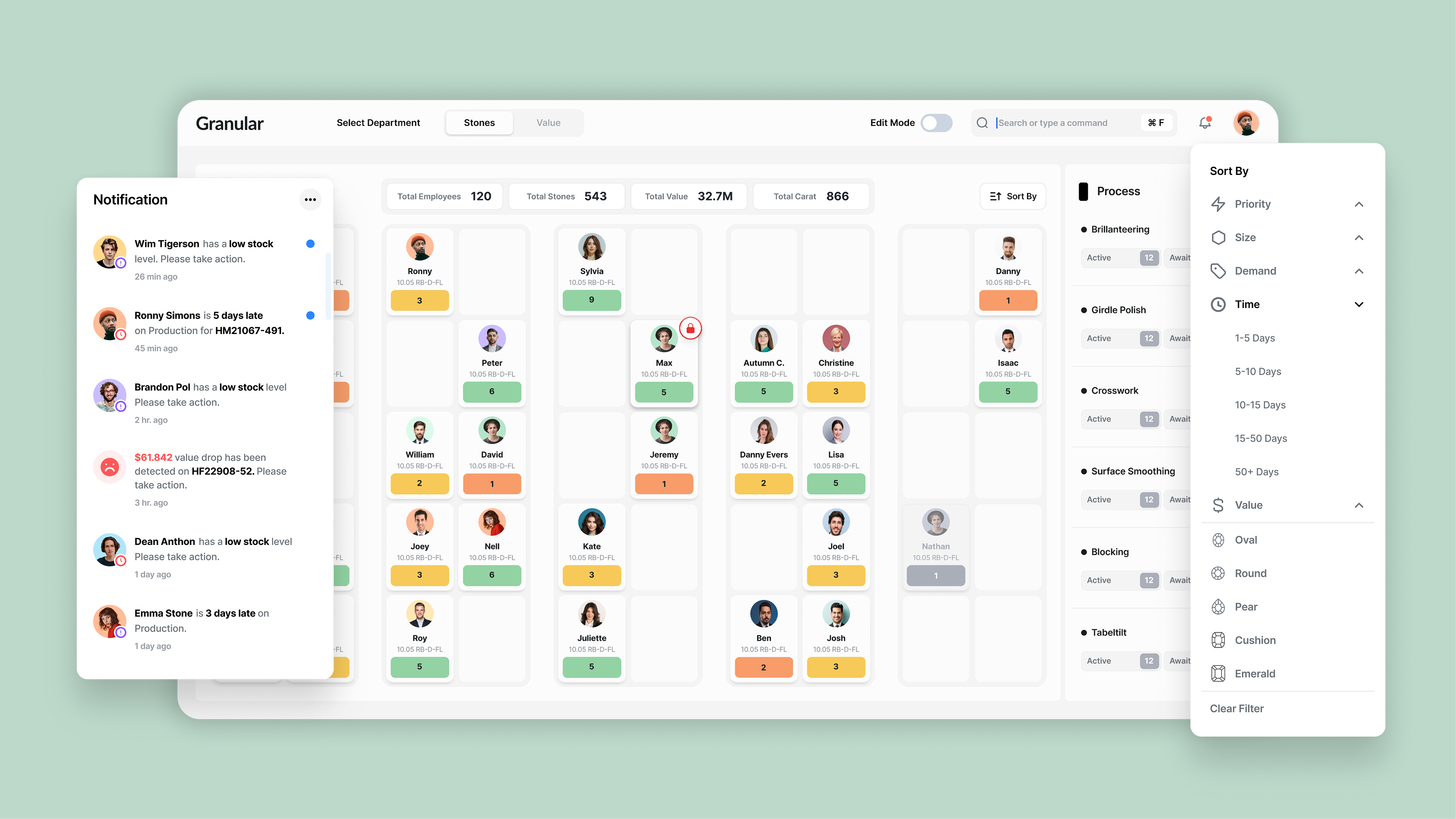
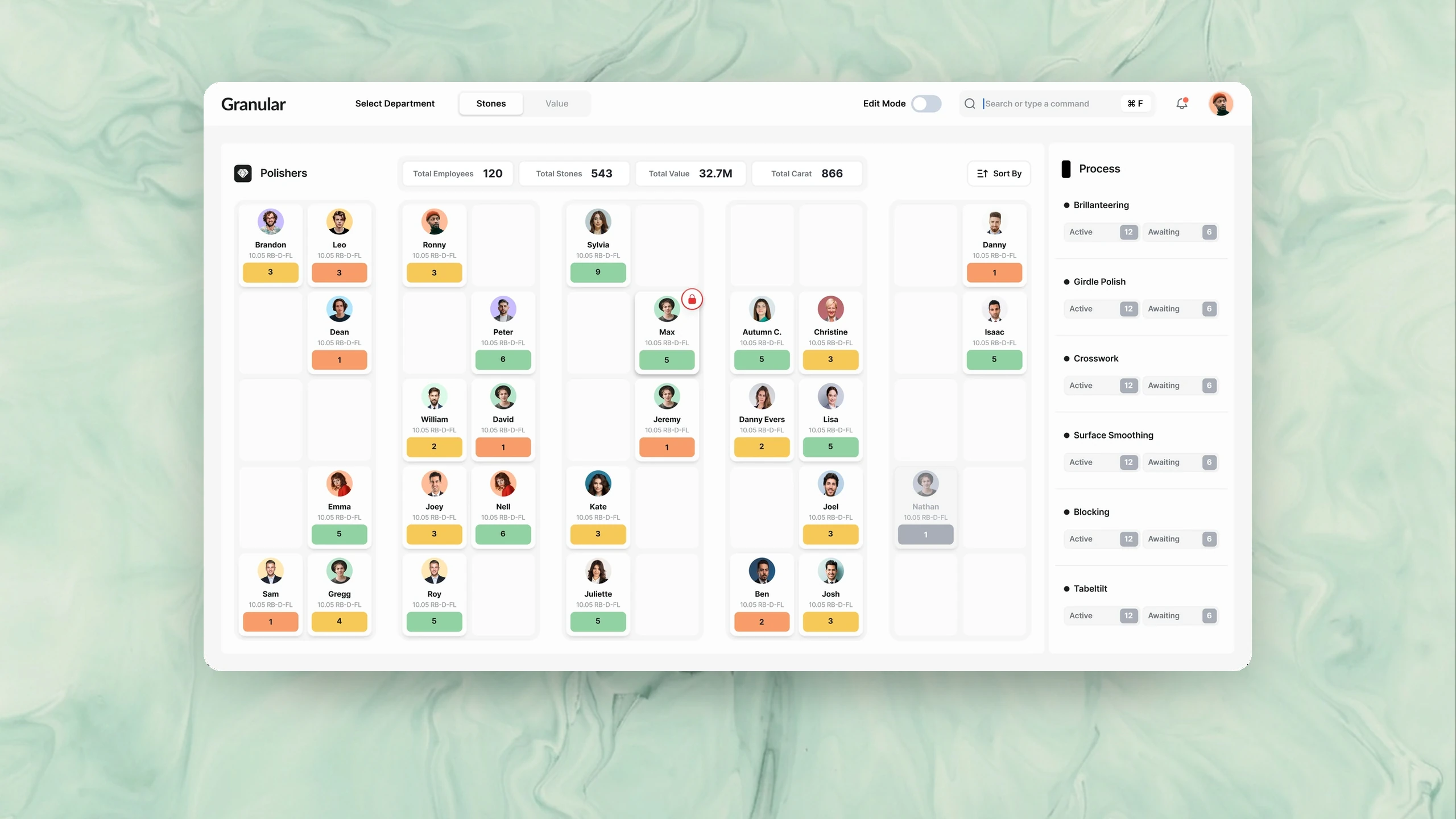
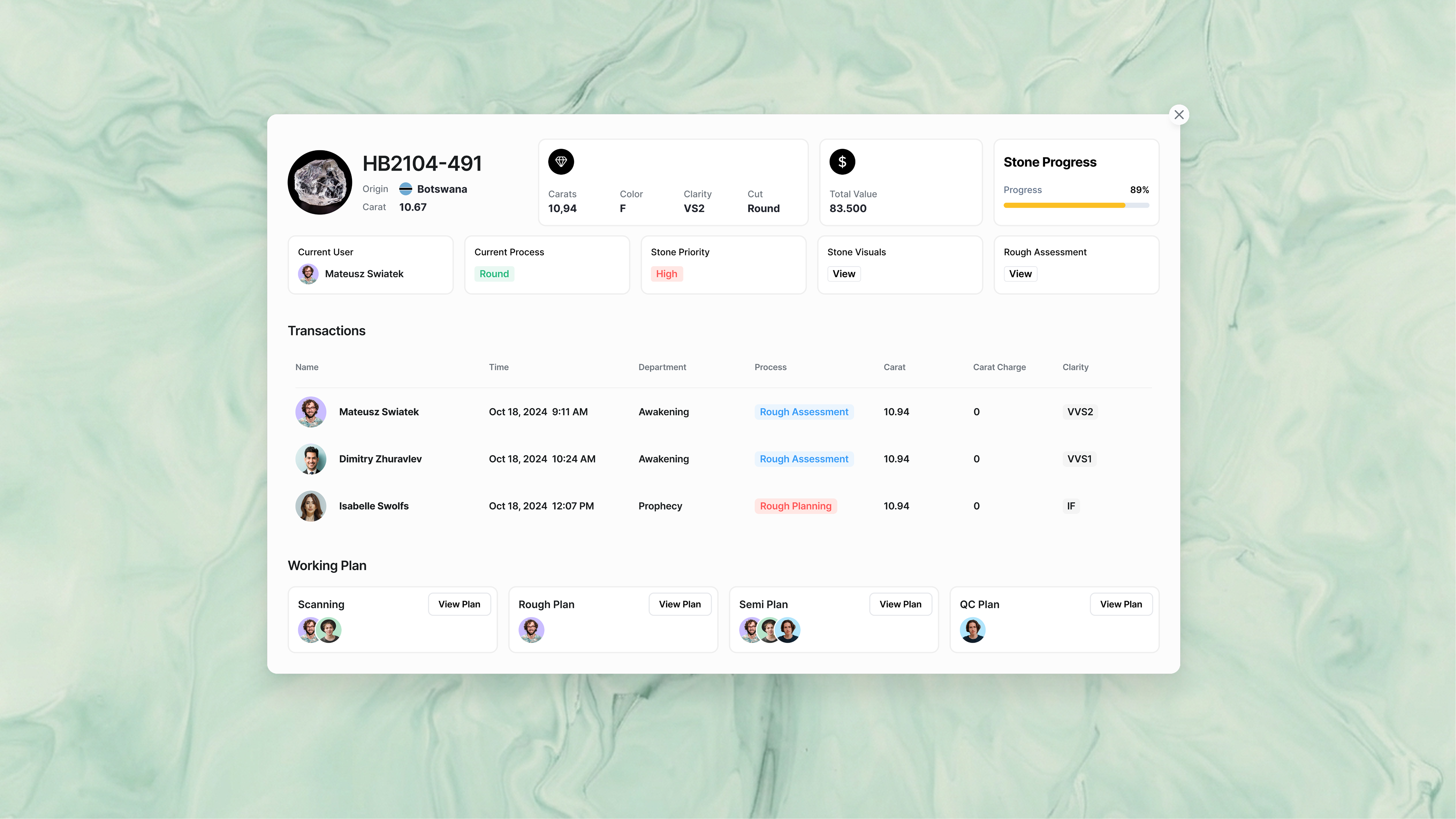
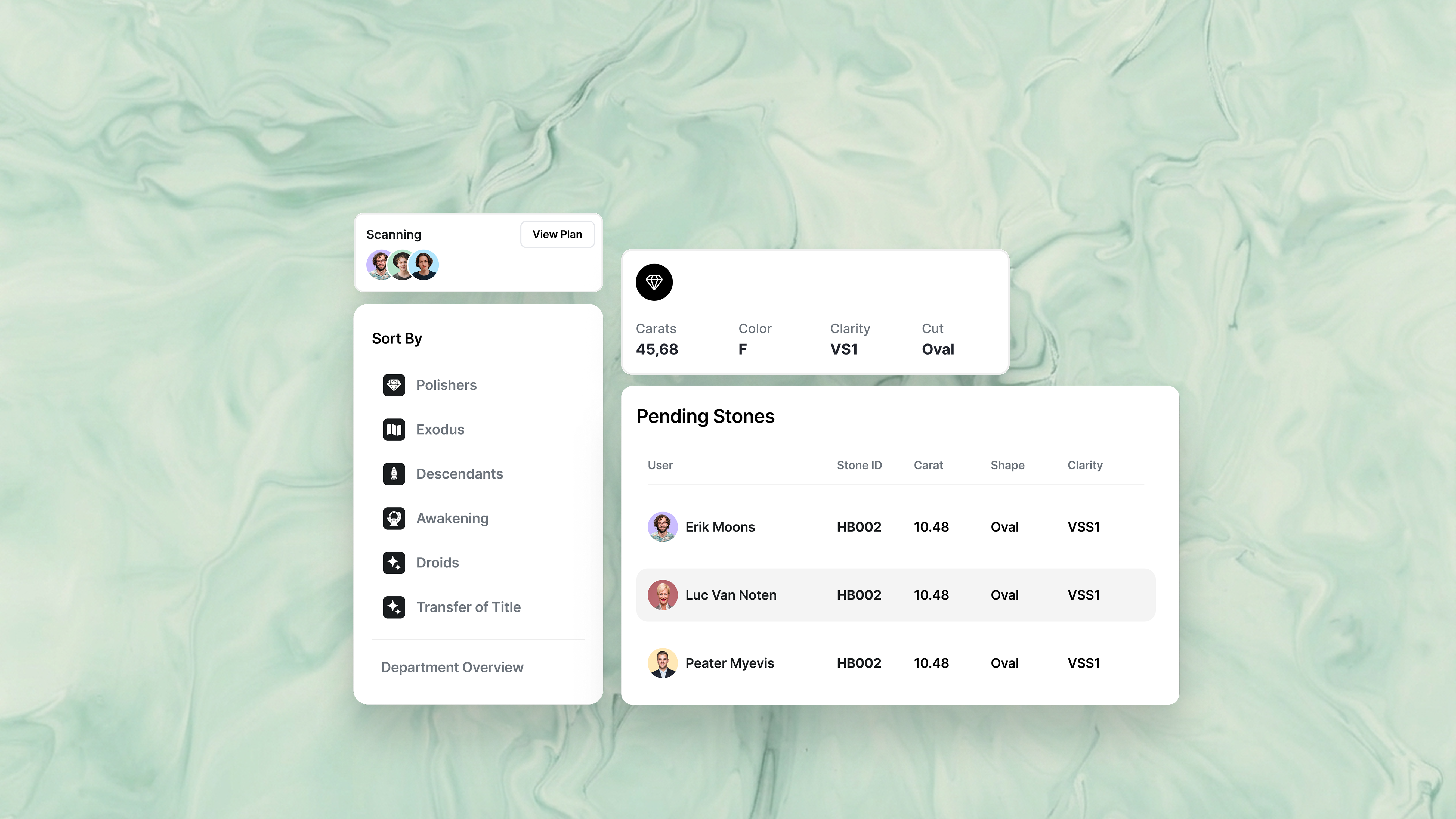
What you see when you open Granular is a grid of cards, one per polisher: their photo, their name, and the stones currently with them. The cards sit in the same order as the seats on the floor, so reading the screen feels like looking at the room. It doesn’t allocate anything, and it never suggests who should get the next stone. He already knew how to make that call. He just couldn’t see the board he was making it on.
The hardest part wasn’t building it. It was being believed. Early on the screen ran about ten minutes behind the floor, so he’d look at Granular, look up, find a stone somewhere it shouldn’t be, and stop trusting the whole thing. Ten minutes sounds like nothing. In practice it was the difference between a tool he worked from and a tool he double-checked. We chased it down with our DevOps engineer until the screen and the floor agreed. That’s the point adoption actually started.
Before
What I found once I stopped asking about the workflow and went and sat next to it.
Screens
Results
Every handover of a stone between workers was already recorded, so our data team could measure the effect in Power BI rather than guess at it. The rest was visible but harder to put a number on: work spread more evenly across the floor, and management could answer their own questions about production instead of interrupting someone to ask. It went into daily use in the polishing department, and we were building views for other departments when I left in September 2025.