A Travel Companion.
For people who dread the fortnight before a flight rather than look forward to it. I designed it end to end in Figma: setting a trip up from a booking code, the run of admin before departure, and a door to door sequence on the day itself.
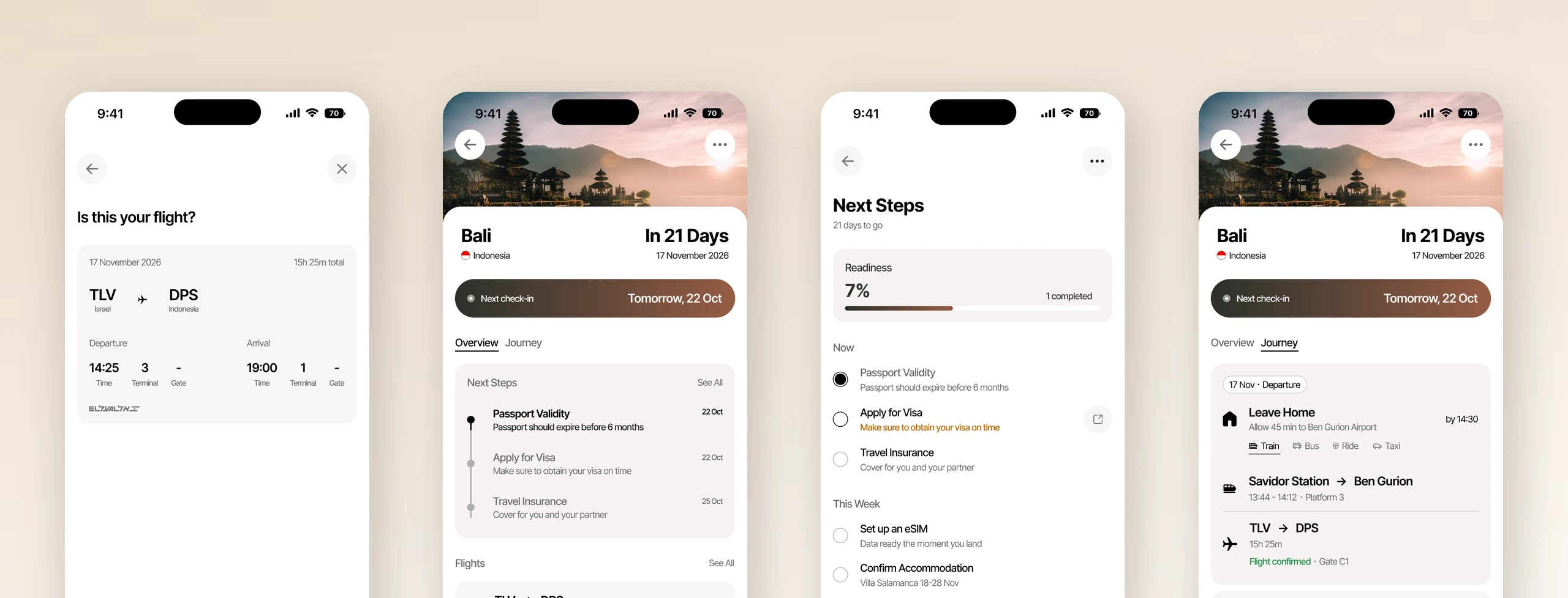
Overview
A trip that is fully booked is not a trip that is settled. The flights are paid for and the villa is confirmed, and there is still a rule about your passport needing six months left on it that you can never quite remember the shape of. There is a visa you are fairly sure you need and slightly unsure how long it takes. There is the question of how early is early enough for the airport, which nobody answers the same way twice. None of it is hard. It is scattered, each piece living in a different tab or email or group chat, and each one carrying a small penalty for getting it wrong.
I talked to people who travel often and dread it anyway, and what came back was not that they forget things. It is that they check. The same handful of facts, over and over, from Maps, from the airline app, from a WhatsApp thread, right up to the morning of the flight. One of them described spending the whole day before a flight moving between those three, then landing with no signal and no plan, and arriving too drained to enjoy the first day. The cost is not a missed step. It is the checking, and the state it leaves you in when you arrive.
So the job is not to remind anyone. It is to make checking cheap, and to be the one place worth checking. That shapes all three parts of Hush.
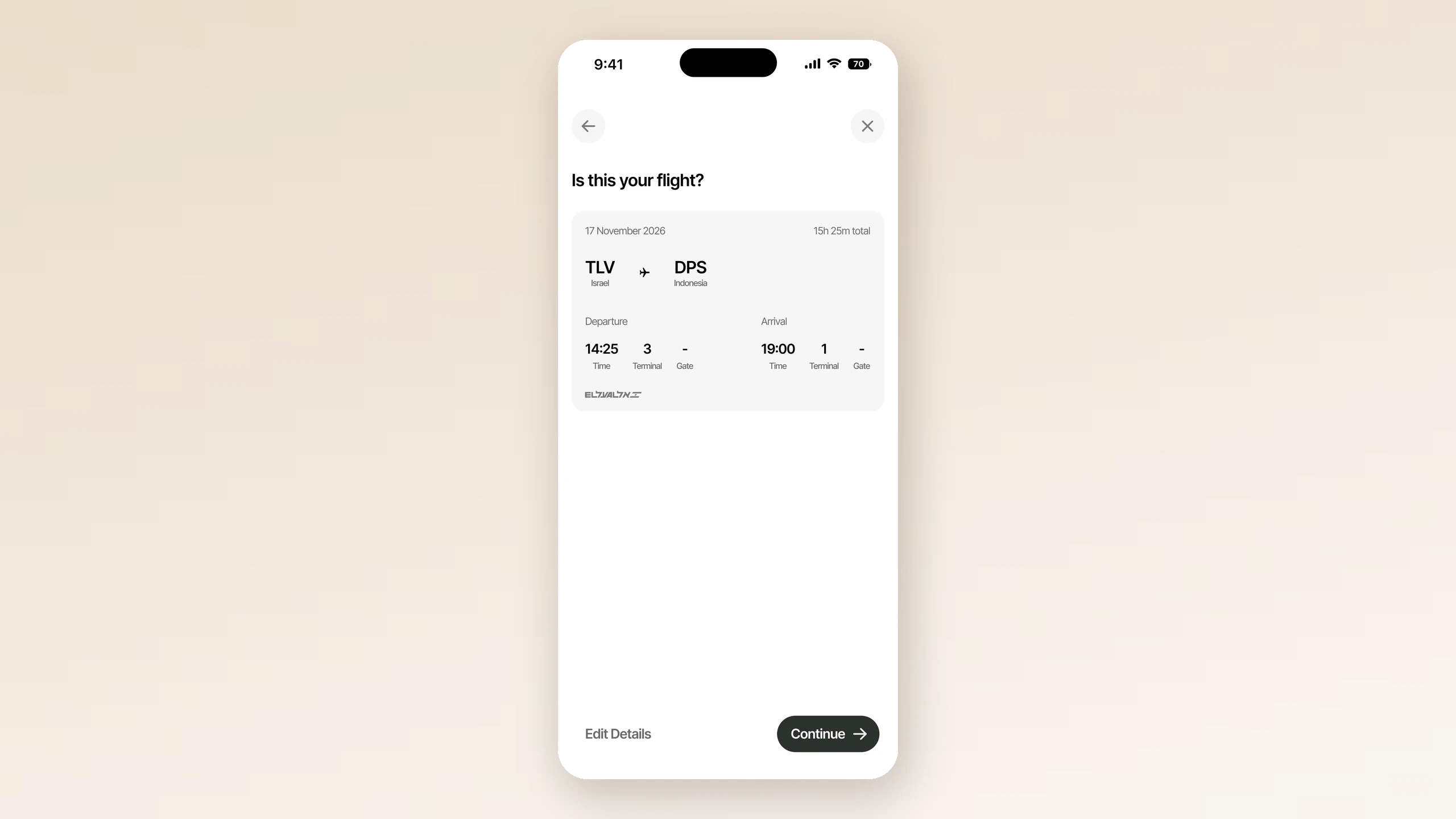
You give it a trip once. A booking code and a last name, or a flight number and a date, and it goes and finds the rest, then shows you what it found and asks whether that is your flight: Tel Aviv to Denpasar, 17 November, fifteen and a half hours, terminal 3. Everything the app does afterwards comes from that one answer, which is the point. The alternative is a form, and a form is the thing an anxious person is already avoiding.
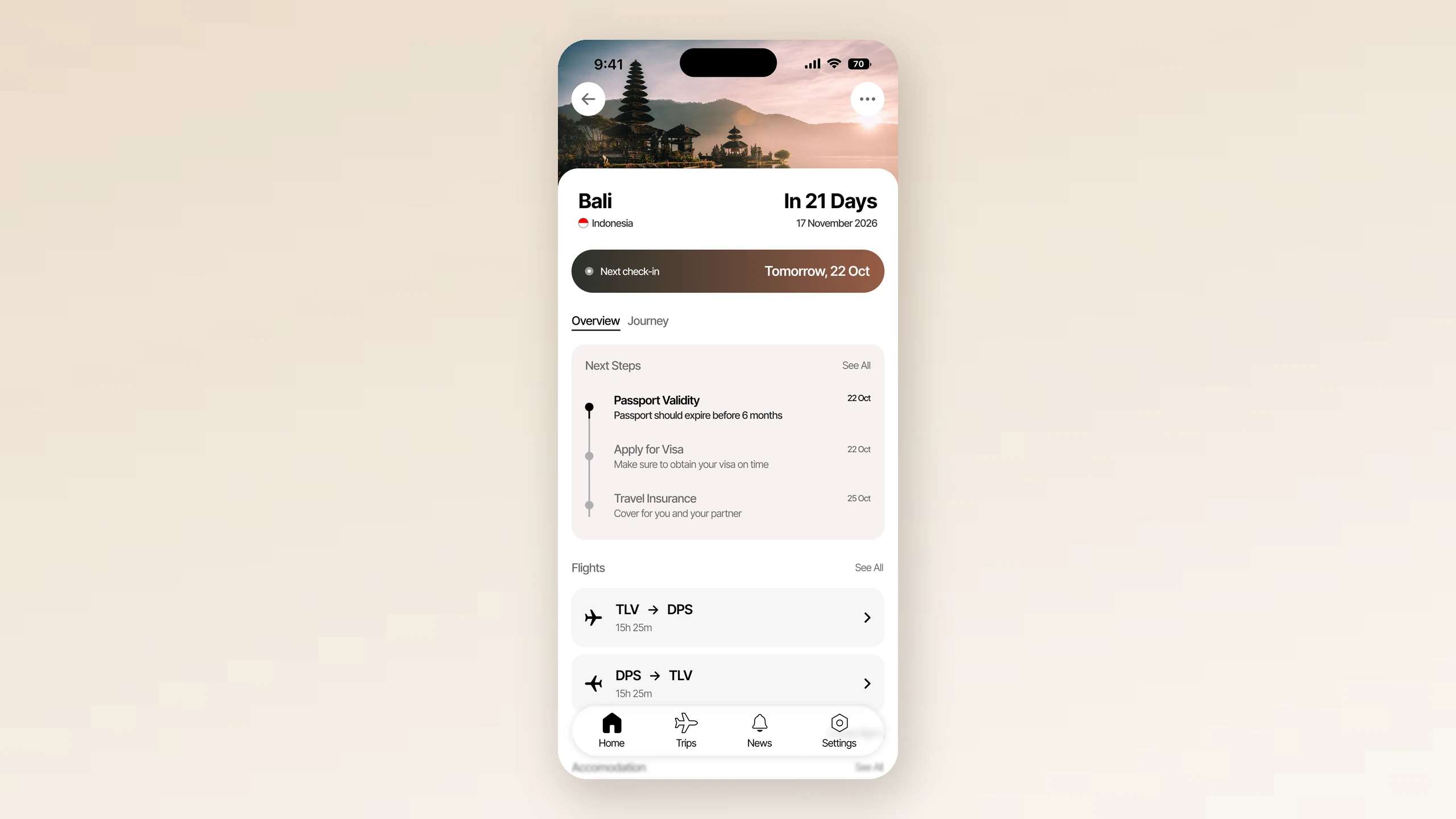
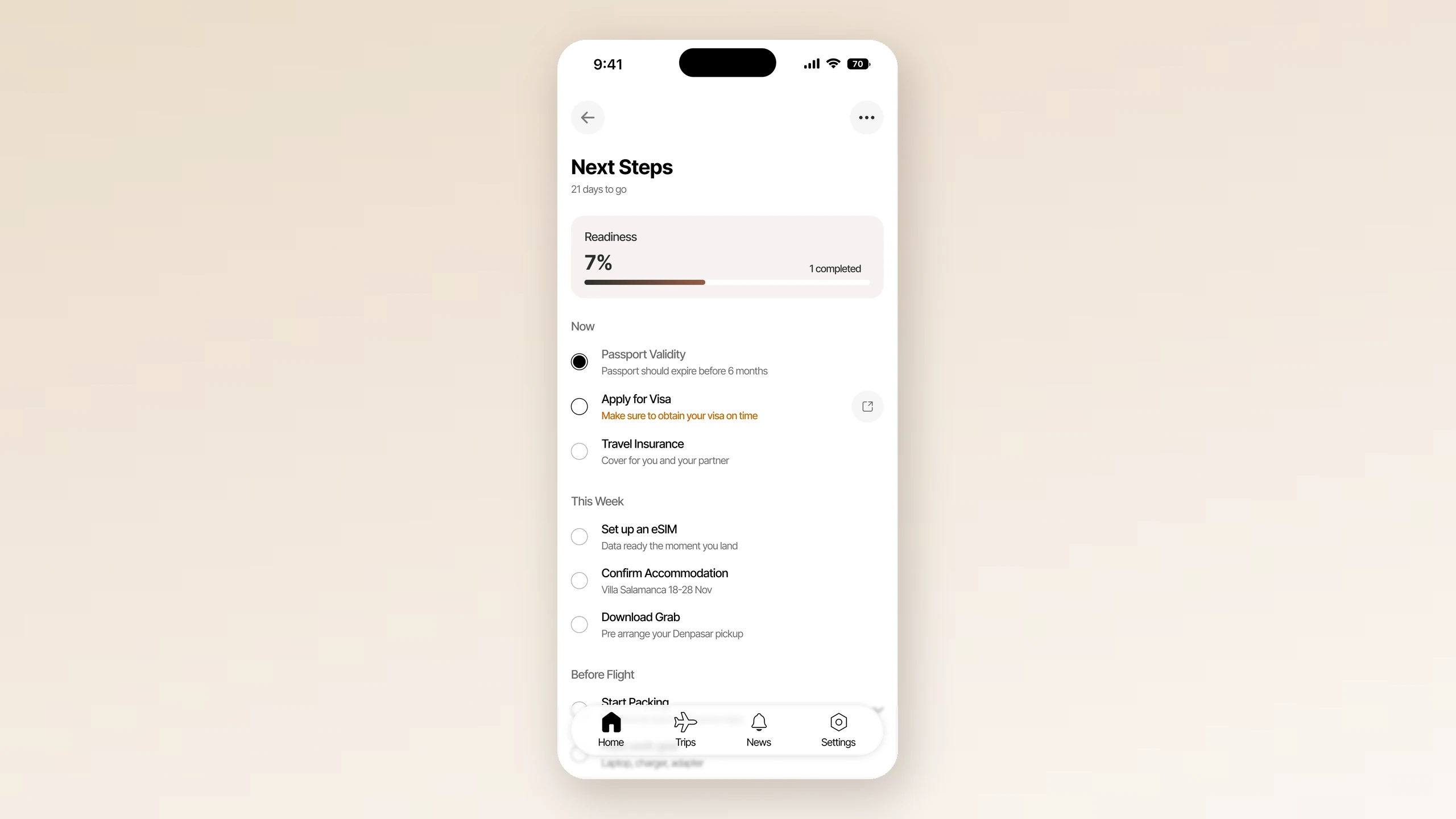
Then the run up to departure. The trip screen is the overview: Bali, in 21 days, next check-in tomorrow, the flights out and back. The checklist opens the same trip up, and it is grouped by when you have to act rather than by what kind of thing it is. Now, This Week, Before Flight, Departure Day. Passport validity and travel insurance sit in Now with dates against them. The visa sits in Now too, and it is the only step on the screen in amber, because it is the only one with an external deadline you cannot recover from once it has passed. An eSIM, the accommodation, installing Grab for the airport pickup: real tasks, but nothing breaks if they happen on Thursday instead of Tuesday, so they sit a group down and stay quiet.
Above all of it is a readiness figure, a percentage with a count of what is done. That is the decision I would defend hardest. A checklist app assumes its user forgets. This user does not forget, they re-check, so a single number saying how ready the trip is answers the question they keep asking in the time it takes to open the app. It is also why completed steps stay on the list, ticked, instead of dropping off it. An efficient design hides what is already handled. Someone anxious wants to see that it is handled.
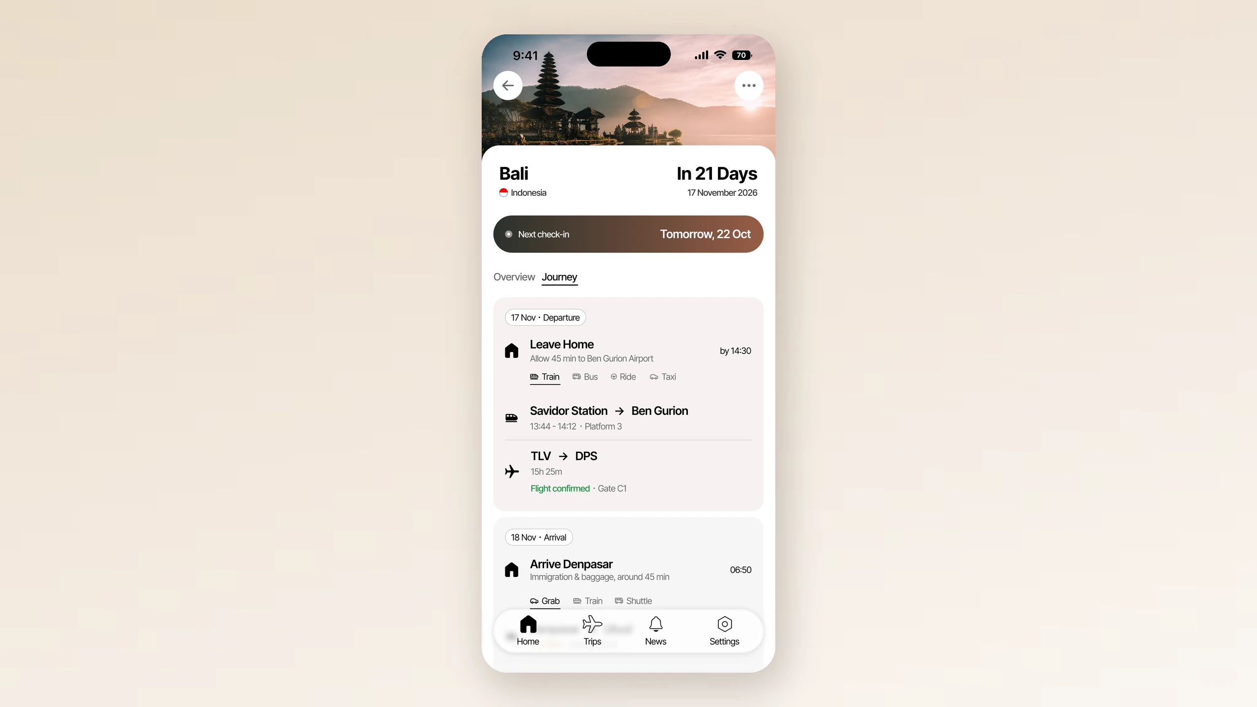
The third part is the day itself, and it is the one I would show first. Hush stops being a checklist and becomes a sequence. Leave home, allowing forty-five minutes to Ben Gurion. The train from Savidor, and the platform it goes from. The flight, with its gate. Immigration and baggage at Denpasar, which takes about forty-five minutes. Then Grab, because that is what people use there. One instruction at a time, in the order you need them, door to door.
The hard part was designing for a state I do not share. I am not an anxious traveller, and putting myself in the shoes of someone who is meant turning down the version of nearly every screen that was merely efficient.
Hush is a design exercise. I did the research, the flows, the states and every screen myself in Figma. It has not been built.
Before
Why a travel app, and not a packing list. What came back from people who travel often and dread it anyway.
Screens